Documentation
Terms Of Service
Privacy Policy
What's Next
About Us
Documentation
Terms Of Service
Privacy Policy
What's Next
About Us
The future of mrthn can be found here.
The next possible step that we wanted to have for mrthn was data aggregation. Users (anonymized) could be collected, and then available for study. This anonymized data would include data points such as steps taken, calories expended and total distance walked/ran every day. This would allow us to compare the data between different platforms, and see any overall trends followed by the users of mrthn.
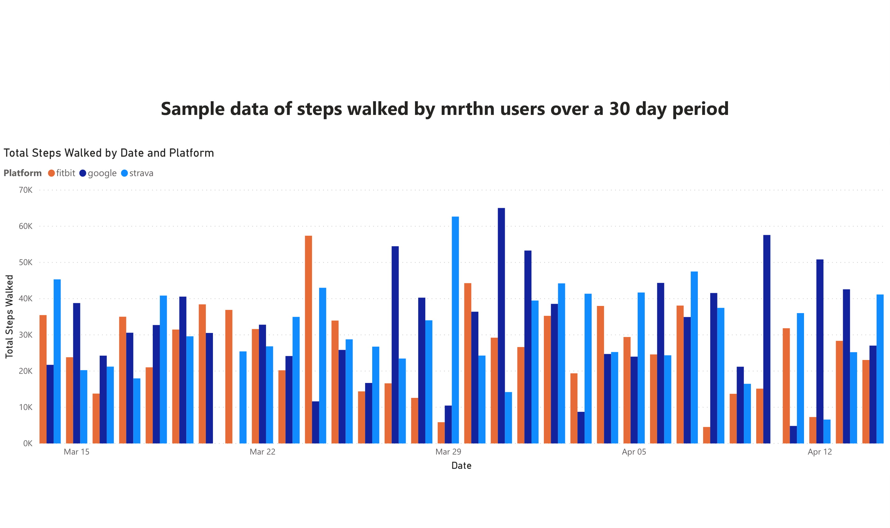
In order to showcase some possibilities that mrthn data aggregation could provide, the following tables were created. The data for these tables were randomly generated, but they mimic mrthn users, and showcase sample data for 30 days of fitness activities.
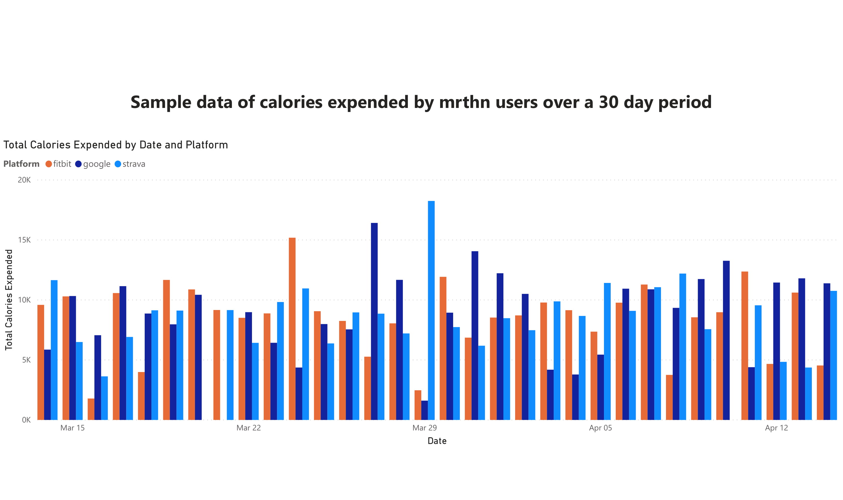
The above graph shows how many total calories were expended by mrthn users over a 30 day period. These users are split via platform so we can directly compare the performance of users across all integrated platforms daily. Data such as this canallow us to see the average activity level of our users, and determine periods of lessor more activity than usual.
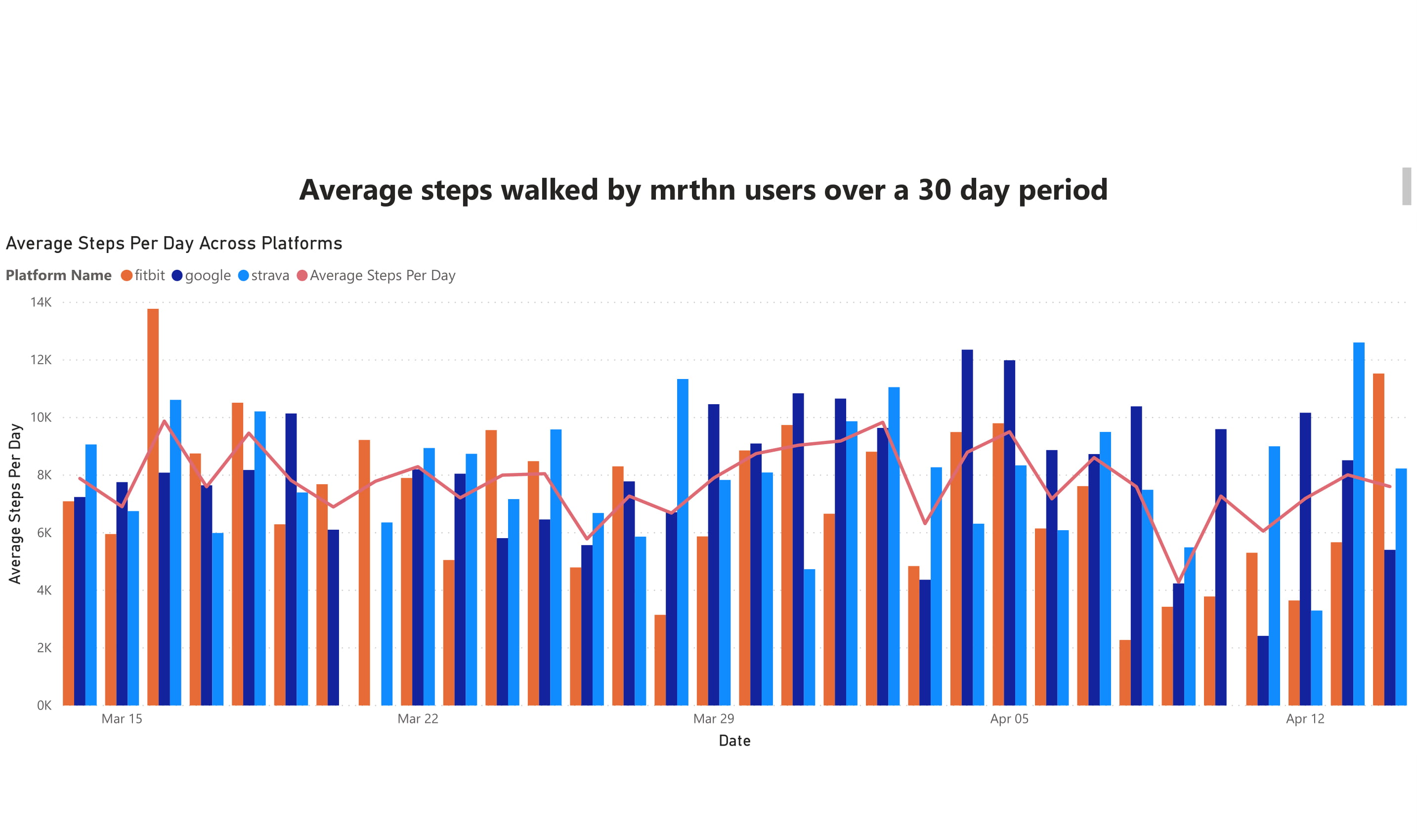
The above graph compares how each platform did in terms of average daily user steps. Using this data, we can see daily if a platform had users that overperformed or underperformed compared to the daily average. Over time, this will allow us to see when users are most active on average, which may allows us to predict incoming spike of new users.
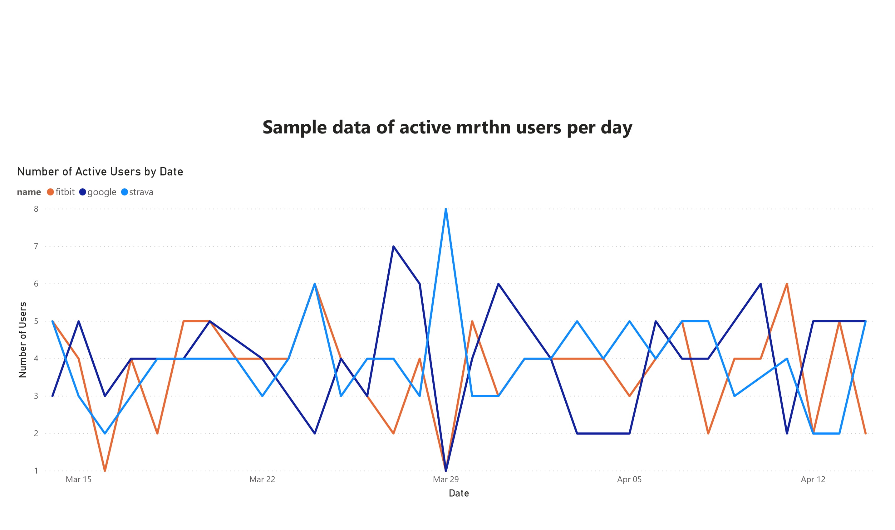
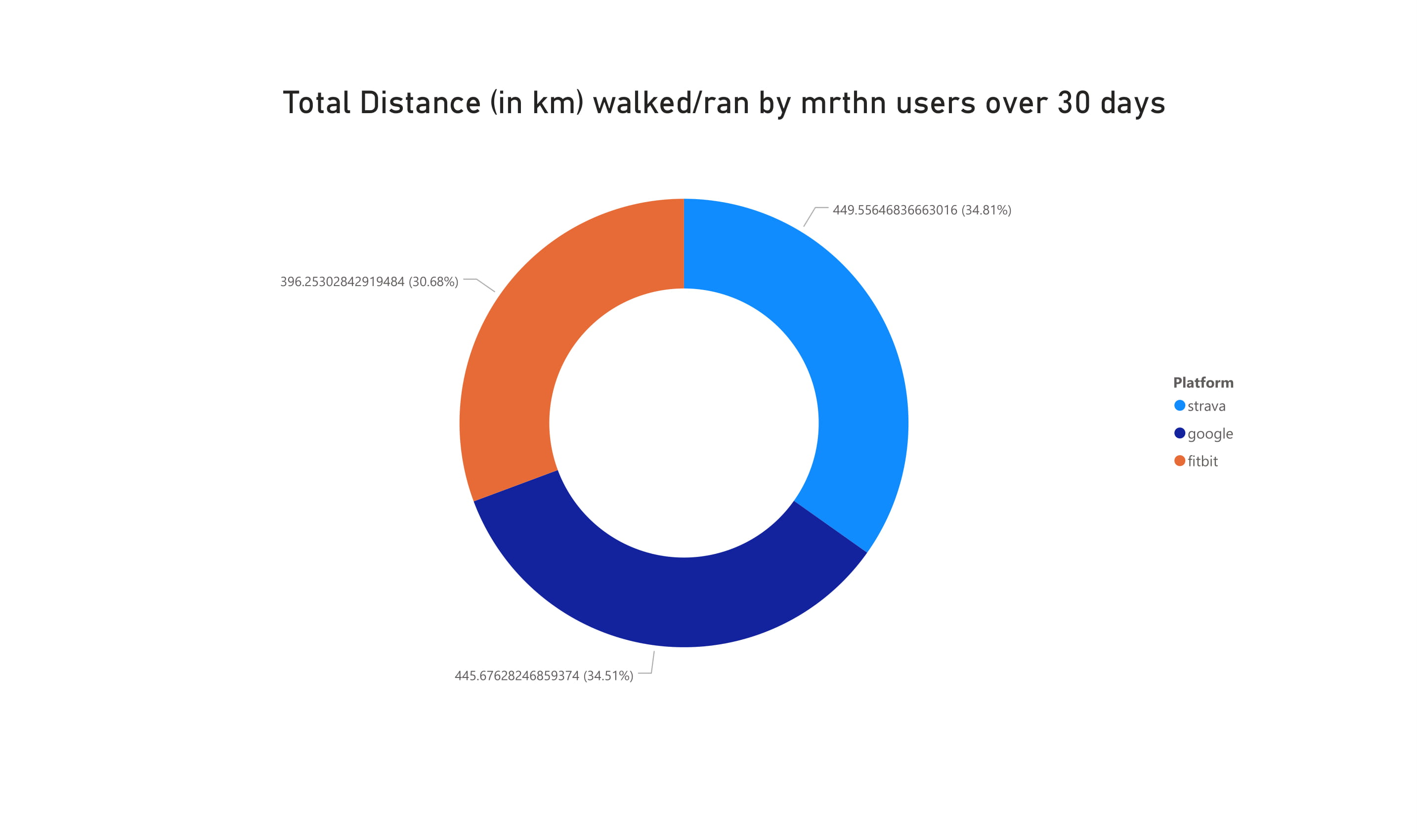
The above graph displays how many users of each platform were active during any given day. Data such as this allows us to see which platforms have a significant portion of mrthn users, and whether there are large gaps between the least to most popular platforms.